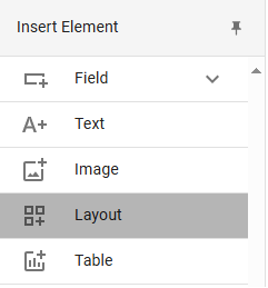
# Designing a Basic Form

## Layout

Forms are structured using sections, which are further divided into columns where different types of data fields are added.

To add new sections or columns, go to the toolbar and click on the ***Layout*** option.

<figure><img src="https://1817123835-files.gitbook.io/~/files/v0/b/gitbook-x-prod.appspot.com/o/spaces%2F6gW1YnQoR7lwDfSXSQR9%2Fuploads%2Fgit-blob-111cd61c83f71d61ecda42e21b69a09f5bed9aee%2Fbuild_elementos_higlight_layout.png?alt=media" alt=""><figcaption><p>_**Layout**_ option</p></figcaption></figure>

When you click, the tool will be selected, and the cursor will display a colored line in the space where the column (if being added within an existing section) or section (if not being added to an existing one) will be placed. You can add as many sections and columns as needed.

<figure><img src="https://1817123835-files.gitbook.io/~/files/v0/b/gitbook-x-prod.appspot.com/o/spaces%2F6gW1YnQoR7lwDfSXSQR9%2Fuploads%2Fgit-blob-31d7b3aeec2595109716f0996bcc9466a1b4d4ed%2Fa%C3%B1adir_layout.png?alt=media" alt=""><figcaption><p>
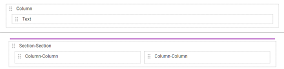
Adding a new section</p></figcaption></figure>

Sections take up the full width of the form, while columns have a total size of 12 units, equivalent to 100% of the section's width. When selecting a column, the ***Properties*** panel will appear. In the ***General*** section, you can view general properties such as size and title.

Start by inserting a new section. Next, insert a column within the section and reduce its width to 6 units. Then, insert another column next to it, so there are two pairs of columns within the section.

Finally, click the ***Save*** button to save your progress.

Now it's time to rename the sections. Click on the first section and go to ***Properties > General > Title***. We'll name this section "Personal Data." Then, go to the second section and name it "Contact Information." Next, select each of the columns and ensure they don't have a title, as these will be assigned to the fields.

<figure><img src="https://1817123835-files.gitbook.io/~/files/v0/b/gitbook-x-prod.appspot.com/o/spaces%2F6gW1YnQoR7lwDfSXSQR9%2Fuploads%2Fgit-blob-663832dee6292757cea0bbb11a531fb5fa4a1116%2Flayout_propiedades.png?alt=media" alt=""><figcaption><p>
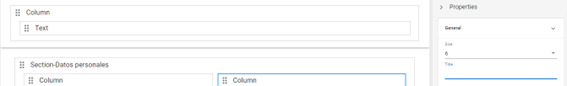
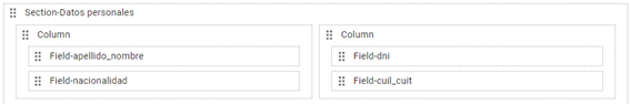
Section properties panel</p></figcaption></figure>

We will now start adding components to the form. Some elements will be useful for displaying static information, while others will allow you to collect user data.

## Static Elements

Among the static elements, we find the ***Text*** and ***Image*** tools, which allow you to add fixed text or images. These types of elements are generally used to add titles, logos, or provide help messages or highlighted information to the end user.

<figure><img src="https://1817123835-files.gitbook.io/~/files/v0/b/gitbook-x-prod.appspot.com/o/spaces%2F6gW1YnQoR7lwDfSXSQR9%2Fuploads%2Fgit-blob-00806eaf520f49028e9bddc66ca99da37e7ab971%2Fbuild_elementos_higlight_image_layout.png?alt=media" alt=""><figcaption><p>
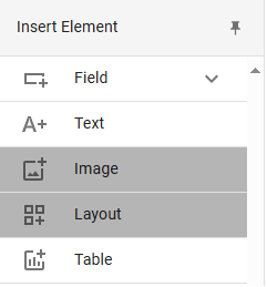
Text and image elements</p></figcaption></figure>

In the default form, this field is used within the column in the upper section to display the form's name. As with sections, you can go to ***Properties > General > Title*** to modify its name. We'll name it the same as the form: "Data Update."

<figure><img src="https://1817123835-files.gitbook.io/~/files/v0/b/gitbook-x-prod.appspot.com/o/spaces%2F6gW1YnQoR7lwDfSXSQR9%2Fuploads%2Fgit-blob-e168d3610072611a0a33b66de569505ff6180970%2Frenombrando_campo_texto.png?alt=media" alt=""><figcaption><p>
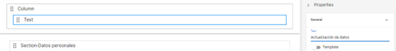
Renaming a text field
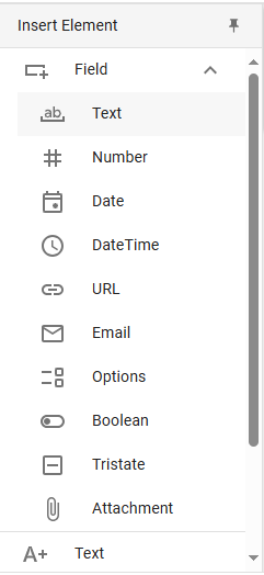
</p></figcaption></figure>

## Input Fields

Input fields offer greater variety, as they are designed to record different types of data. In addition to tables, which have their own button in the toolbar, you can find all the options you need in the ***Text field*** dropdown.

<figure><img src="https://1817123835-files.gitbook.io/~/files/v0/b/gitbook-x-prod.appspot.com/o/spaces%2F6gW1YnQoR7lwDfSXSQR9%2Fuploads%2Fgit-blob-c7f9dec8b32d392350bf35c4ee673cf12b66881d%2Fbuild_elementos_higlight_field_text.png?alt=media" alt=""><figcaption><p>Fields</p></figcaption></figure>

We will add two basic types of fields to our form:

<table><thead><tr><th width="123">Field</th><th>Usage</th></tr></thead><tbody><tr><td><strong>Text</strong></td><td>Allows the entry of a single line of text, useful for brief data such as names and addresses.</td></tr><tr><td><strong>Number</strong></td><td>Configured to accept only numeric characters, useful for applications like phone numbers, IDs, and quantities.
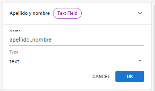
</td></tr></tbody></table>

Select the ***Text*** option from the dropdown and click on the first column of the "Personal Data" section to add it.

The ***Properties > Name*** section is used to assign a name that identifies each specific field in the form. It is recommended that names do not contain spaces and are clear, as they will only be visible internally, allowing you to retrieve and organize data. Rename this field as "last\_name\_first\_name" and press ***OK*** (or the *enter* key).

<figure><img src="https://1817123835-files.gitbook.io/~/files/v0/b/gitbook-x-prod.appspot.com/o/spaces%2F6gW1YnQoR7lwDfSXSQR9%2Fuploads%2Fgit-blob-564d50c596a1c390f7f5c27d64a5e08500621ae3%2Frpa_5.png?alt=media" alt=""><figcaption><p>_**Name**_ property</p></figcaption></figure>

Place another text field below, rename it "nationality," and press ***OK***.

Now repeat the same procedure in the second column, but this time adding a numeric field and another text field. Select the ***Number*** option from the dropdown and place a field we will call "id\_number." Then, from the ***Text*** option, insert a field where the user will enter their tax ID, which we will call "tax\_id" (known as "CUIL/CUIT" in Argentina).

The fields should look like this:

<figure><img src="https://1817123835-files.gitbook.io/~/files/v0/b/gitbook-x-prod.appspot.com/o/spaces%2F6gW1YnQoR7lwDfSXSQR9%2Fuploads%2Fgit-blob-2c48c3784f8965355fa01836c35dbefef0aad393%2Frpa_6.png?alt=media" alt=""><figcaption><p>Fields with defined _**Name**_ properties</p></figcaption></figure>

Later, we will delve deeper into the properties, appearance, and behaviors of each type of element and explore various validation options. For now, we will focus on the *General* section:

<table><thead><tr><th width="124">Property</th><th>Function</th></tr></thead><tbody><tr><td><strong>Label</strong></td><td>Allows you to set the name the end user will see when accessing the form.</td></tr><tr><td><strong>Size</strong></td><td>Defines the field's width. As with columns and sections, the 12 units are proportional and mean the field occupies 100% of the column it is in. This number can be reduced by decreasing its size, freeing up space to insert new fields alongside existing ones.</td></tr><tr><td><strong>Required</strong></td><td>Specifies whether the form field is mandatory (<em>True</em>) or not (<em>False</em>). Note that, as we will see later, this property can be replaced by the validation expression <em><strong>isEmpty</strong></em>, which provides a more specific and personalized message when a field is left blank.</td></tr></tbody></table>

Select each of the fields you have created and set the following values:

* ***Label*** will be named in each case: *Last Name and First Name, Nationality, ID Number, and Tax ID.*
* ***Size*** will retain the default width of 12 units.
* ***Required*** will have the value *True* for all four fields, making them mandatory.

<figure><img src="https://1817123835-files.gitbook.io/~/files/v0/b/gitbook-x-prod.appspot.com/o/spaces%2F6gW1YnQoR7lwDfSXSQR9%2Fuploads%2Fgit-blob-636bd29f06fbc2d1aa509f4de13c44445516199d%2Frpa_7.png?alt=media" alt=""><figcaption><p>_**
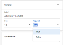
Required**_ property</p></figcaption></figure>

To check your progress, you can use the Live Editor mode of the visual editor, which you will find under the name ***Preview*** to the right of the form elements. When you activate the button, it will show you a real-time preview of your form, where you can continue editing the properties of its components and testing its functionality.

<figure><img src="https://1817123835-files.gitbook.io/~/files/v0/b/gitbook-x-prod.appspot.com/o/spaces%2F6gW1YnQoR7lwDfSXSQR9%2Fuploads%2Fgit-blob-62b743745bade51db088196f5e998a75c6212669%2Fbuild_preview.png?alt=media" alt=""><figcaption><p>
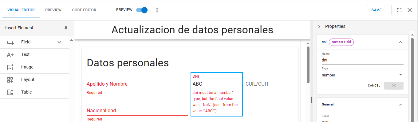
Real-time preview mode</p></figcaption></figure>

The main limitation of this mode is that you cannot add new fields or layout elements, so you will need to deactivate it to continue working on your form design.

Now it's time to complete the second section: "Contact Information." Add a *Text* field in the first column. Define the properties ***Name:*** "email" and ***Label:*** "Email Address." Add another ***Number*** field in the second column, with the properties ***Name:*** "phone" and ***Label:*** "Phone Number." If you add a component by mistake, you can always delete it by selecting the element and clicking the ***Delete*** option displayed in the bottom-right corner.

<figure><img src="https://1817123835-files.gitbook.io/~/files/v0/b/gitbook-x-prod.appspot.com/o/spaces%2F6gW1YnQoR7lwDfSXSQR9%2Fuploads%2Fgit-blob-1636b1dd6fabb1a4605aacc1043295908d7b7f09%2Fopcion_delete.png?alt=media" alt=""><figcaption></figcaption></figure>

When you're done, click ***Save*** to save the form and go to the ***Preview*** option located next to the visual editor and code editor buttons to check the final design of your form in this initial stage.

<figure><img src="https://1817123835-files.gitbook.io/~/files/v0/b/gitbook-x-prod.appspot.com/o/spaces%2F6gW1YnQoR7lwDfSXSQR9%2Fuploads%2Fgit-blob-7fa2b4a289487edd1296c520ed852e91467b4229%2Frpa_9.png?alt=media" alt=""><figcaption><p>_**Preview**_ option</p></figcaption></figure>

Finally, click the cross to close the form and return to the main screen of your workspace.

<figure><img src="https://1817123835-files.gitbook.io/~/files/v0/b/gitbook-x-prod.appspot.com/o/spaces%2F6gW1YnQoR7lwDfSXSQR9%2Fuploads%2Fgit-blob-a85490b12a111bc0ec93b1f39e401e7beb398e5f%2Frpa_10.png?alt=media" alt=""><figcaption><p>_**Save**_ and _**Exit**_ options</p></figcaption></figure>

Congratulations! You have completed the quick start guide by learning how to create a form with new sections and components to collect basic data. Keep progressing to learn more about the features and functions of RPA Connect.
